Switching Bitcoin price charts from one type to another gives a clear as day look at what appears to be a full-blown breakout into a bull market.
Better yet, the price action also shows a retest of downtrend resistance turned support, which could act as a launchpad for the cryptocurrency.
Understanding Technical Analysis, Trend Lines, Subjectivity, and Bias
Reading through Bitcoin-related subreddits or glancing through crypto Twitter comments reveals a strong disbelief in technical analysis.
Some argue that drawing lines on charts is a senseless practice, and price action will do whatever it wants regardless. It’s not possible to predict the future, but technical analysis supplies traders and analysts with probabilities at which they can build a strategy around.
Technical analysis is a highly subjective practice, clouded by bias. With enough scouring, any preconceived bias can find support through indicators, oscillators, or trend lines.
Drawing trend lines alone can be highly subjective when charting Bitcoin. Valid trend lines have the most touches, that analysts agree on.
However, some chartists cut wicks, drawing lines across candle bodies only, while others draw lines across wicks themselves. Others, use a combination of the two – usually to fit their own personal bias.
Related Reading | Two Bitcoin Charts Side by Side Shows Trendlines Can be Massively Biased
But not all Bitcoin price charts are candlesticks. There are also Renko, Heikin Ashi, Point and Figure, and many more types of charts, that can supply analysts with unique intel about the market.
Line charts are one of these types of charts some analysts rely on to provide a unique perspective on price action. Without wicks, line charts can make breakouts appear that much more clear.
An updated line chart of Bitcoin price action on weekly and monthly timeframes appears to indicate that Bitcoin has broken out from downtrend resistance. Even more bullish yet, the asset also may have completed a retest of resistance turned support.
BTCUSD Weekly Line/Candlestick Comparison | Source: TradingView - Click Here For Full Size
Bitcoin Price Line Chart Shows Full-Blown Breakout Into Bull Market
As explained above, some traders choose to draw trend lines across candle bodies, while others prefer wicks. Switching from a Japanese candlestick chart to a line chart can help provide additional clarity.
The above comparison chart shows the significance of switching from Japanese candlesticks to line charts. Without wicks, there’s little discrepancy to argue over which trend lines are the most valid.
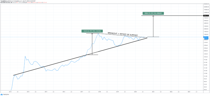
Zooming out further in the chart below, a breakout of downtrend resistance has not only occurred, but its retested and held resistance turned support.
BTCUSD Monthly Line/Candlestick Comparison | Source: TradingView - Click Here For Full Size
If the breakout is indeed confirmed and any additional retests continue to hold, a new bull market is already here. The target of the larger triangle pattern Bitcoin has been trading in for nearly four years measures from the highest and lowest point of the triangle.
Related Reading | An Explosive Bitcoin Price Movement May Not Arrive, Concerning Data Shows
This would give Bitcoin price a target of $98,000 per BTC at the next peak.
Price predictions range as high as $100,000 to as much as $1 million per BTC. And with only 21 million BTC to ever exist, these estimates aren’t overblown or outrageous.
BTCUSD Monthly Line Chart | Source: TradingView
The days, weeks, and months ahead for Bitcoin price are critical, as the cryptocurrency must hold this key resistance as support. Without any downtrend support left to hold back the asset, Bitcoin will soon retest $14,000, and then possibly its former all-time high.
A break of $20,000 would put Bitcoin back into price discovery mode, with only psychological and Fibonacci extension resistance left in its path towards $100,000 BTC.


