2.
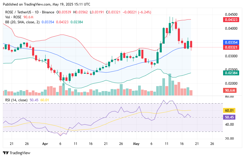
Don’t worry — it’s a lot simpler than you think. The charts you’ll commonly see in our price analyses, as well as on crypto exchanges, are known as candlesticks.
There is method behind the madness here. When performing technical analysis, you’ll want to see how prices have evolved over a period of days, weeks or months, but seeing an average value for each 24-hour period won’t tell the full story.
Candlesticks enable you to see the full details of how the price of a crypto asset fluctuated over the course of one trading session and make comparisons that span a longer period of time.
This is achieved down to their shape, and you’ll notice that each candlestick has two thin lines with a thicker rectangle in the middle. It almost looks like a vertical rolling pin.
When prices have gone up over the course of the day, the candlestick will be green. The thin line at the bottom shows the lowest price that was recorded for the crypto asset during the trading session, while the thin line at the top shows the highest price that was reached. The bottom of the thicker section shows how much the asset was trading for when markets opened, while the top of that rectangle illustrates the price upon closing.
Meanwhile, when prices take a tumble, the candlestick turns red. The principle for reading the chart is the same, but everything is inverted. Now, the thin line at the top shows the highest price for the day, and the thin line at the bottom shows the low. The trading session illustrated by the thick red line, from top to bottom, illustrates where prices stood when the markets opened and closed.
It’s a beautiful invention that’s been tried and tested for centuries — and given how prices in the crypto world can be so volatile, it’s common to see charts that provide a candlestick for every hour over the course of the day.


