Twitter is bearish, abuzz with chatter of a descending triangle that is forming on the Bitcoin (BTC) chart and with comparisons to the descending triangle that broke down in 2018 at $6,000.
Twitter is often wrong. Let’s first define the descending triangle.
A descending triangle is among the most famous classical “bearish” chart patterns used in technical analysis. It is created when price forms a descending trend line with lower highs, while a second horizontal trend line with equal lows evolves.
Strict chartists use candle wicks and require the touches to be alternating, with at least 2 touches to one line and 3 touches to the other, as seen below in a downtrend.
This pattern can occur in both uptrends and downtrends, often has receding volume before breakout (78% of the time), and is confirmed when price closes above or below one of the trend lines. Those are the boring basics.
An interesting fact that few people know — while this is viewed as an extremely bearish pattern, the statistics do not agree.
According to Bulkowski (the undisputed authority on chart patterns), descending triangles break up 53% of the time.
Further, when the triangle occurs in an uptrend, it is likely to break up 63% of the time. Even if price is forming a descending triangle on the current Bitcoin price chart, the odds that it breaks down are only 37%.
Does that sound bearish?
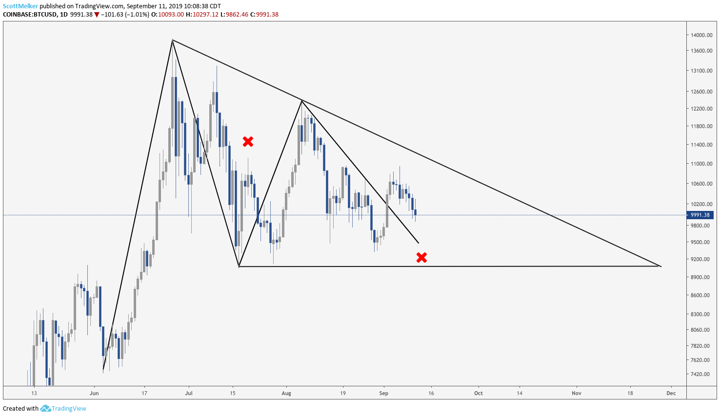
Is there a descending triangle on the current Bitcoin chart?
In our opinion, no. The idea is there, but the specific criteria are not met. The two touches on the horizontal support (the second wick does not even technically touch) do not have a touch up to the descending resistance between them.
BTC/USD chart. Source: Tradingview.com
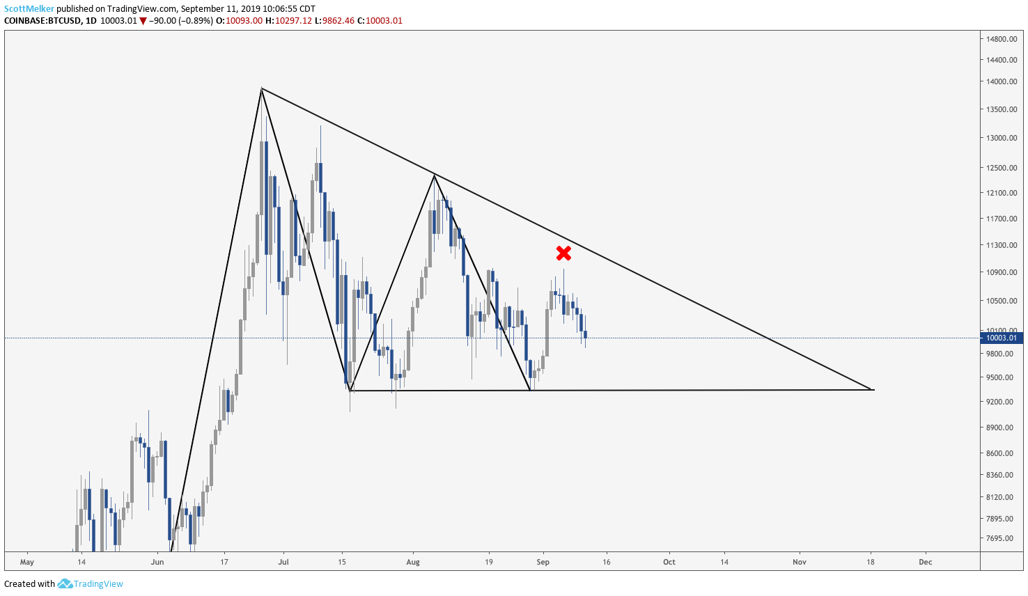
We have seen many traders draw the bottom line as seen below, in an effort to make the pattern appear more valid. They often explain this by saying that the bottom is generally an “area and not a line.”
For strict chartists, this is unacceptable. Further, even if the horizontal line is forced, there is no third touch on the descending resistance to confirm the pattern.
BTC/USD chart. Source: Tradingview.com
The difference in lows (using the wicks) is over 10% of the entire structure’s height, which lends credence to the argument that a descending triangle does not exist. Usually, traders look for it to be no more than 6%-8%.
What is the correct pattern?
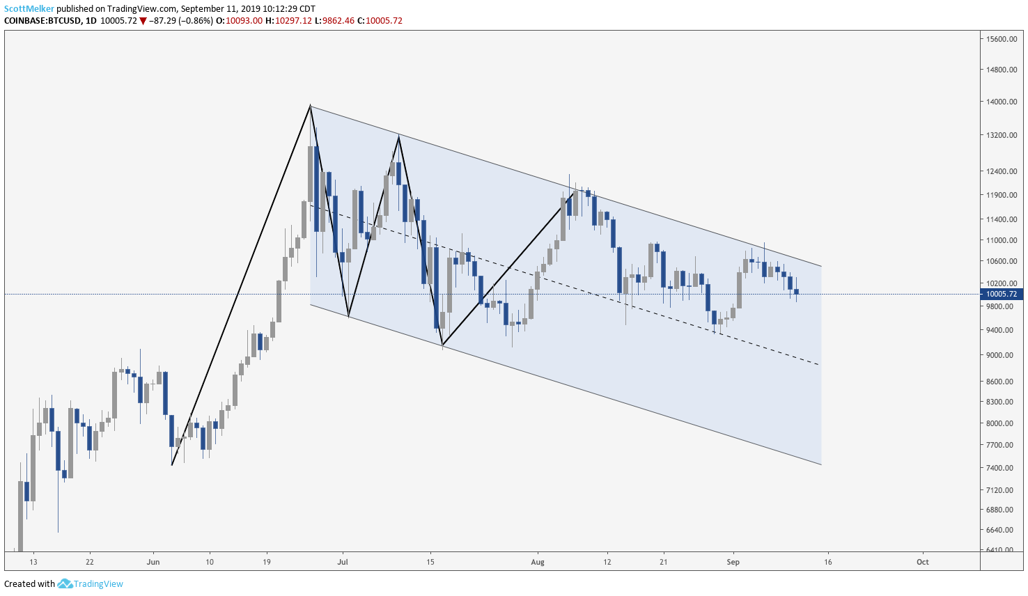
There is a confirmed descending channel (often called a “bull flag”) with three touches on the descending resistance, and two touches on the descending support line. This pattern existed before the descending triangle was even a thought — there is no reason to attempt to draw a new pattern before the previous one is invalidated.
BTC/USD chart. Source: Tradingview.com
What about the infamous descending triangle at 6K?
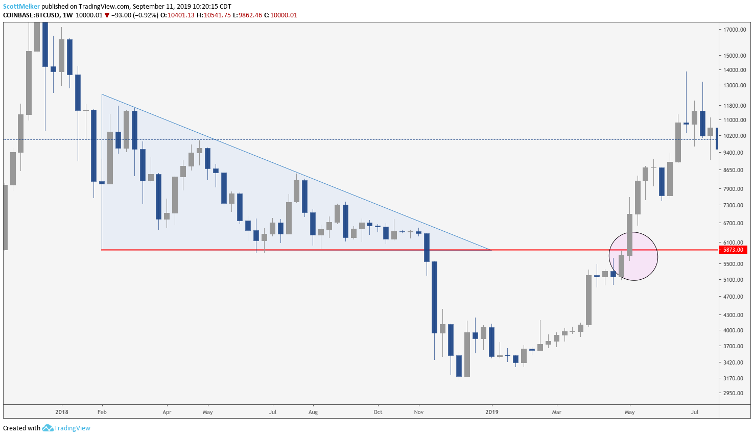
Bitcoin price famously formed a massive descending triangle with support around $6,000, which broke down in spectacular fashion en route to $3,200.
Unfortunately, traders are comparing the two patterns and suggesting that because the previous resulted in further bearish momentum, this one should result in price heading down as well. Is this the correct way to view it even if the current pattern is seen as a descending triangle?
In our opinion, no! The 2018 triangle did fulfill the technical criteria of alternating touches. However, the triangle did not start at the top of the all-time high where the downtrend began; it started at the drop to $5,873 in February.
In other words, there was already a clear and significant downtrend when the pattern began. The descending triangle that printed at that time was a continuation pattern. And in that vein, if the current pattern is viewed as a descending triangle then traders should expect the same result — a continuation of the trend, which means that they should be expecting the price to rise, rather than drop, out of the pattern.
Further, traders would expect the bottom line of the triangle to behave as significant resistance on the first retest. This was the reason that crypto Twitter insisted that Bitcoin would be strongly rejected at a retest of $6,000 from the bottom. We were screaming the opposite and publicly opening additional long positions.
What happened? As you can see in the pink circle, price passed through $6,000 like a hot knife through butter — there was no supply to be found, which is what you would expect after the breakdown of a descending triangle.
You can argue that BTC price swung around the triangle apex thereby avoiding supply, but at that point, you’re having to stretch for validation. There is another explanation for the consolidation, break and subsequent bull rush back up through what was believed to be significant resistance, but we will save that for next time.
BTC/USD chart. Source: Tradingview.com
Bitcoin price did ultimately continue down, which descending triangle maximalists used as clear evidence that they were correct. As mentioned before, the price was already in a clear downtrend, which is likely the reason that price dropped — simple trend continuation after consolidation.
Price reacting in a manner you anticipate does not necessarily validate a chart pattern.
A pattern is not a pattern until it is confirmed
A descending triangle is nothing more than a consolidation pattern, and most often consolidation patterns result in a continuation of the trend. But never forget, a pattern is not a pattern until it is confirmed as one.
This doesn’t happen until the requisite alternating touches of support and resistance print and volume plays out as required. Traders can do themselves a favor by trying to understand why a pattern exists (the underlying psychology that leads to the pattern formation), rather than just taking what appears to be a pattern at face value and slapping that designation on it without confirmation — and then trading it.
In doing so, they are more likely to profit from that pattern. Contrary to popular belief, technical analysis is more than just the lines on the chart — it’s an understanding of the underlying causes that have formed those lines.
The views and opinions expressed here are solely those of the authors (@scottmelker and Christopher Inks) and do not necessarily reflect the views of Cointelegraph. Every investment and trading move involves risk. You should conduct your own research when making a decision.

