Quant explains how there may be a correlation between the Gemini Bitcoin netflow and BTC price tops, based on pattern of the last few years.
Can Gemini Netflow Predict Bitcoin’s Price Tops?
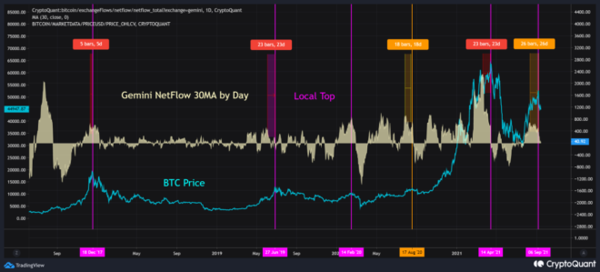
As posted by an analyst on CryptoQuant, the historical chart for the Gemini netflow (30-day MA) vs the price reveals there could be a correlation between the indicator and BTC tops.
The Bitcoin netflow here refers to the net number of coins exiting or entering the crypto exchange Gemini. The indicator’s value is simply calculated by taking the difference between the inflows and the outflows.
When the netflow takes negative values, it means more BTC is moving out of the exchange than in. During such periods, investors are withdrawing their coins to personal wallets, either for hodling or for selling through OTC deals.
Similarly, positive values imply that investors are moving their Bitcoin to exchanges for altcoin purchasing or withdrawing to fiat.
The below chart shows the trend for the Gemini BTC netflow over the past few years after applying a 30-day moving average (MA):
The correlation between the BTC price and the Gemini netflow | Source: CryptoQuant
The above chart highlights certain time periods in the history of Bitcoin versus the trend of the indicator then. Here is a breakdown:
The first period is 2017. The indicator showed a local top and started declining 5 days before the then price ATH was achieved.
Related Reading | Forget Walmart, Here’s The Real Reason Why Bitcoin Crashed
Next is 2019, where a similar trend seems to have been followed. Here, the BTC price peak wasn’t made until 23 days after the Gemini netflow started declining.
Then there is 2020, which had two instances where the pattern followed. And finally, the indicator was also able to correctly predict the 2021 ATH as well as the top of the latest rally.
Related Reading | Bitcoin Exchange Reserves Lowest In 3 Years, What Does It Mean For The Price?
The chart reveals all these peaks were attained after an average of 20 days from the netflow local top, with the latest high taking the longest (26 days).
Going by these cases, there does seem to be a correlation between the Gemini netflow declining after forming a peak and the Bitcoin price top.
BTC Price
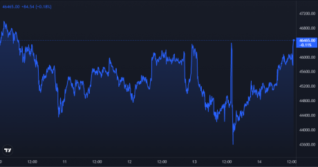
At the time of writing, Bitcoin’s price floats around $46.7k, down 0.1% in the last 7 days. Over the past month, the indicator has gained 1.3% in value.
Here is a chart showing the trend in the price of the coin over the last three months:
BTC's price shows high volatility | Source: BTCUSD on TradingView
Over the last few days, Bitcoin’s value has shown a lot of volatility, and at the moment, it seems to be going back up. Some indicators suggest that BTC’s next move up could very well be the last for this run.


